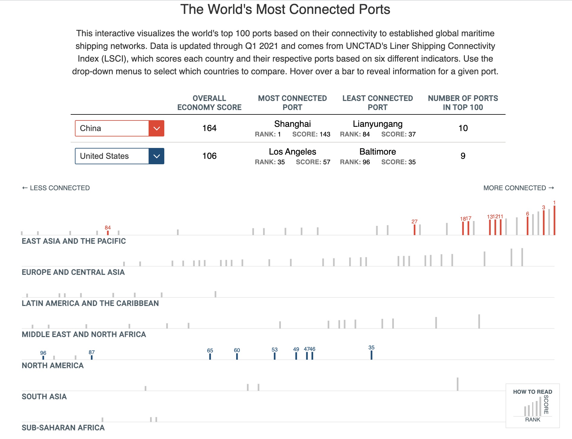
The World's Most Connected Ports.
This interactive visualization shows the ranking and score of the top 100 most connected ports in the world. This d3 + Svelte visual was created for the CSIS ChinaPower Project.
This visualization was my first working with Svelte & D3. The table, chart, and country dropdowns were split into their own components. The selected country data was shared between all 3 components, which made updating the table contents and highlighted lines on the chart a breeze to handle. After my experience with this project, I'm excited to continue to learn how I can leverage Svelte to make visuals.
This was also one of my first times using Observerable to prototype a visual from start to finish. By prototyping, I was able to work with the research program to quickly iterate on a handful of ideas before finally landing on the final version. During the process, we were able to ask several questions and decide on the direction we wanted to take:
- Do we focus on regions or countries, or both?
- Do we want to highlight specific countries' data?
- How can we maximize the usage of color for impact (color all data points or only highlighted ones)?
- What is the relationship between ranking and score?
Design support provided by Christina Hamm.