Projects.
This page features a selection of the websites, data visualizations, and side projects that I've worked on over the years.
-
Trump's (second) first 100 days
How President Trump is overhauling the federal government and upending the legal system in his second term

-
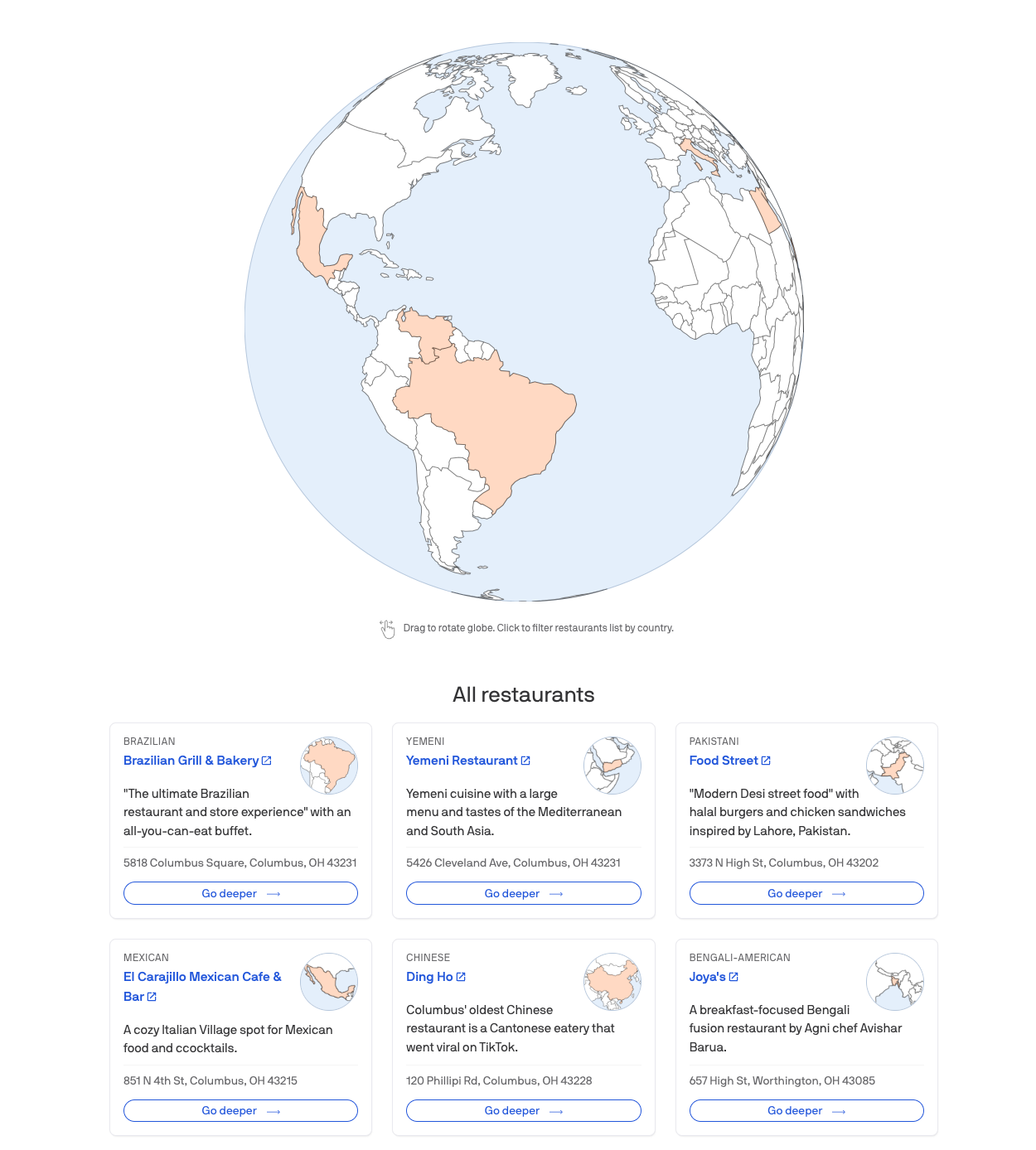
Eating around the world without leaving Columbus
An ongoing project where we're setting out to eat around the world right here in Central Ohio, reviewing some of our most unique and delicious spots while we map their cuisine's nation of origin.
-
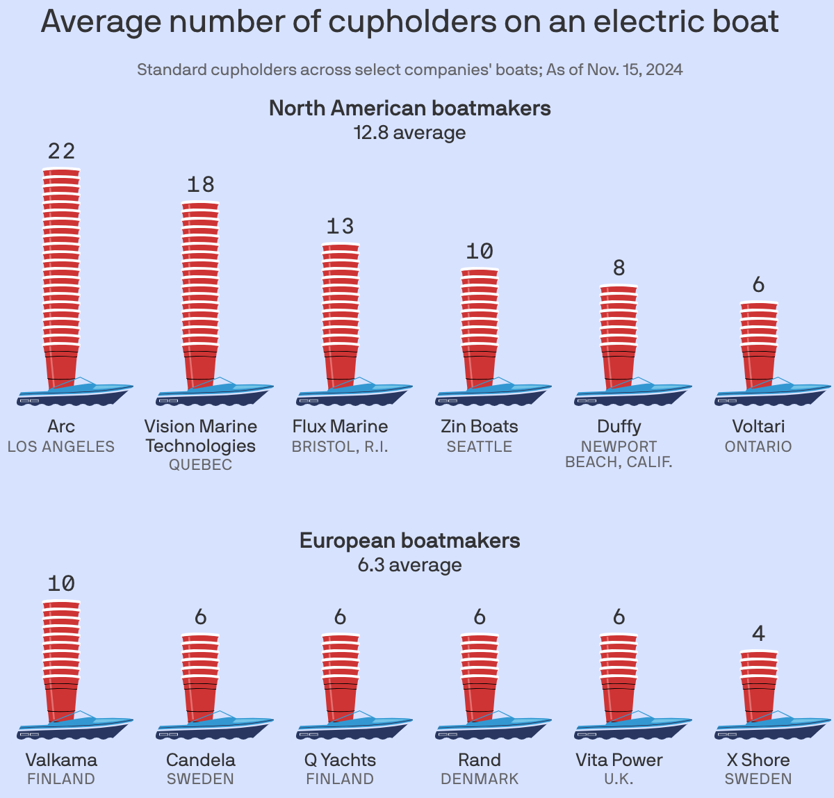
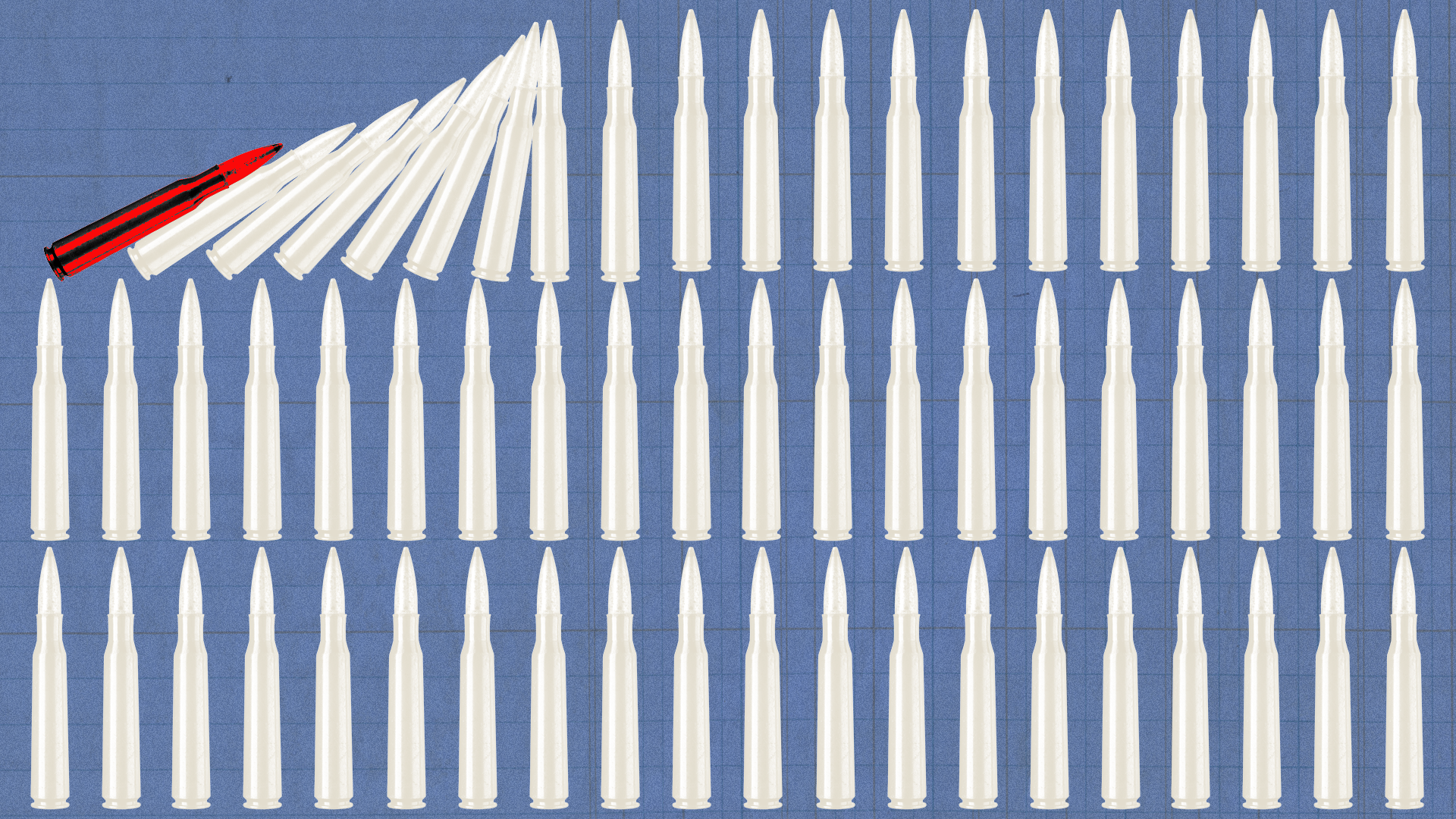
Charted: The electric boat cupholder gap
Electric boats made in the U.S. and Canada contain on average more than twice as many cupholders as those produced in Europe.
-
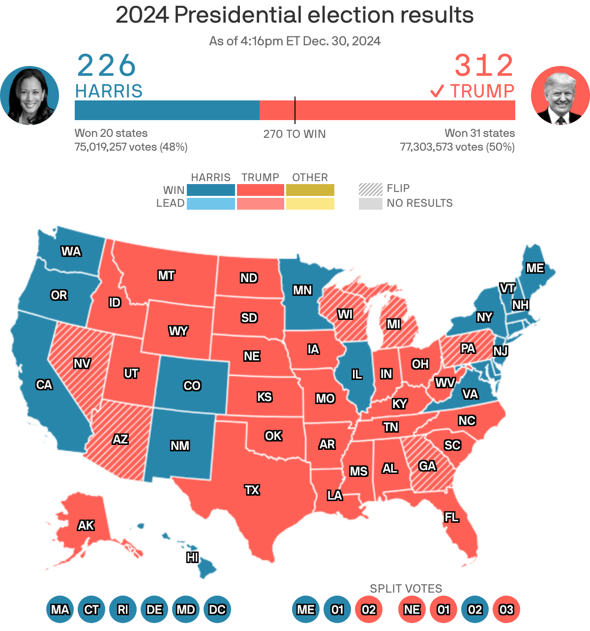
2024 Election Results
Axios reported live results for the 2024 general election based on race calls made by the Associated Press. We created results pages for the presidential, Senate, House and gubernatorial races.
-
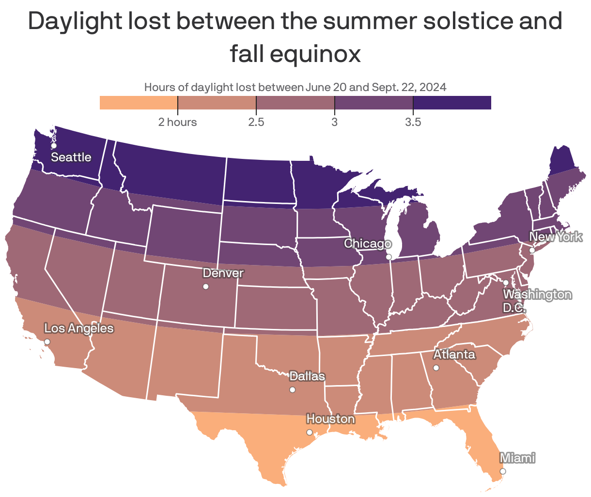
How much daylight you're losing as fall begins
For some Americans, the air is getting crisper and the leaves are starting to change as fall approaches — but one thing's certain no matter your local weather: The days are getting shorter.
-
Domino effect: Violence ripples beyond Gaza
The Israel-Hamas war has triggered new cycles of violence beyond the borders of Gaza, drawing global attention to the network of Iranian-backed militias that wield influence — and arms — across the Middle East.
-
China's Shadow Empire: Reshaping Global Power
A joint investigative series between Axios and Politiken supported by the Pulitzer Center to explore Chinese advancement of geopolitical aims around the world.

-
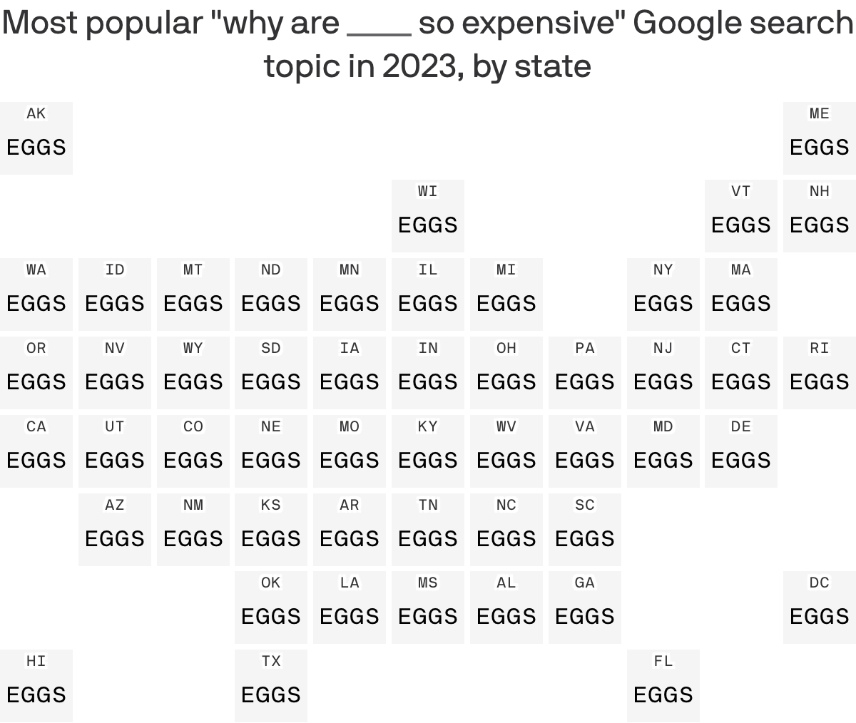
"Eggs" make history as top-ranked Google search on cost in 2023
In a year of high prices across the board, eggs stand out as the item most searched by Americans asking, "Why is ___ so expensive?" In all 50 states and D.C., "eggs" topped the rankings, according to data shared with Axios from new analysis by Google Trends.
-
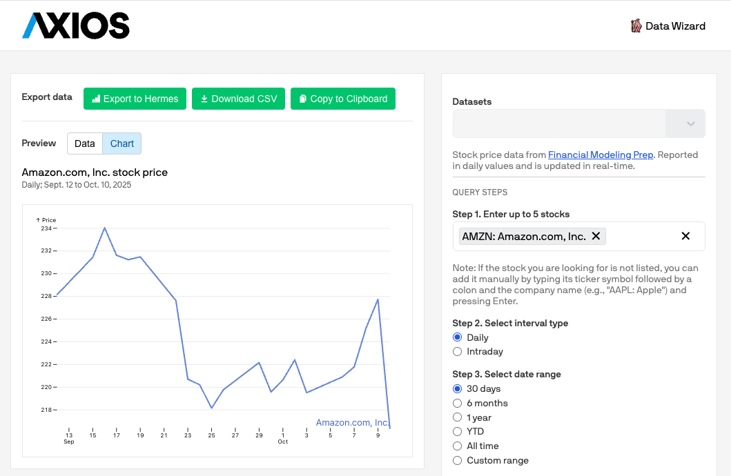
Data Wizard
Tool where reporters can quickly get data from third-party APIs formatted to export into Hermes or other chart making tools.
-
Visit Paris without leaving home
The U.S. is filled with towns and cities that were named after foreign places: You can take a trip to Naples, New York, or Paris, Illinois. There are so many of these cities that you could go on a world tour without ever leaving the U.S. Check out our curated routes for a Mediterranean getaway or a tour of the ancient world.

-
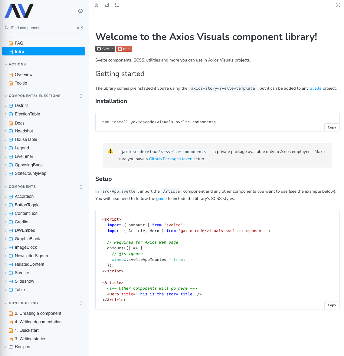
Axios Visuals component library
Svelte components, SCSS, utilities, and more to be used in Axios Visuals projects.
-
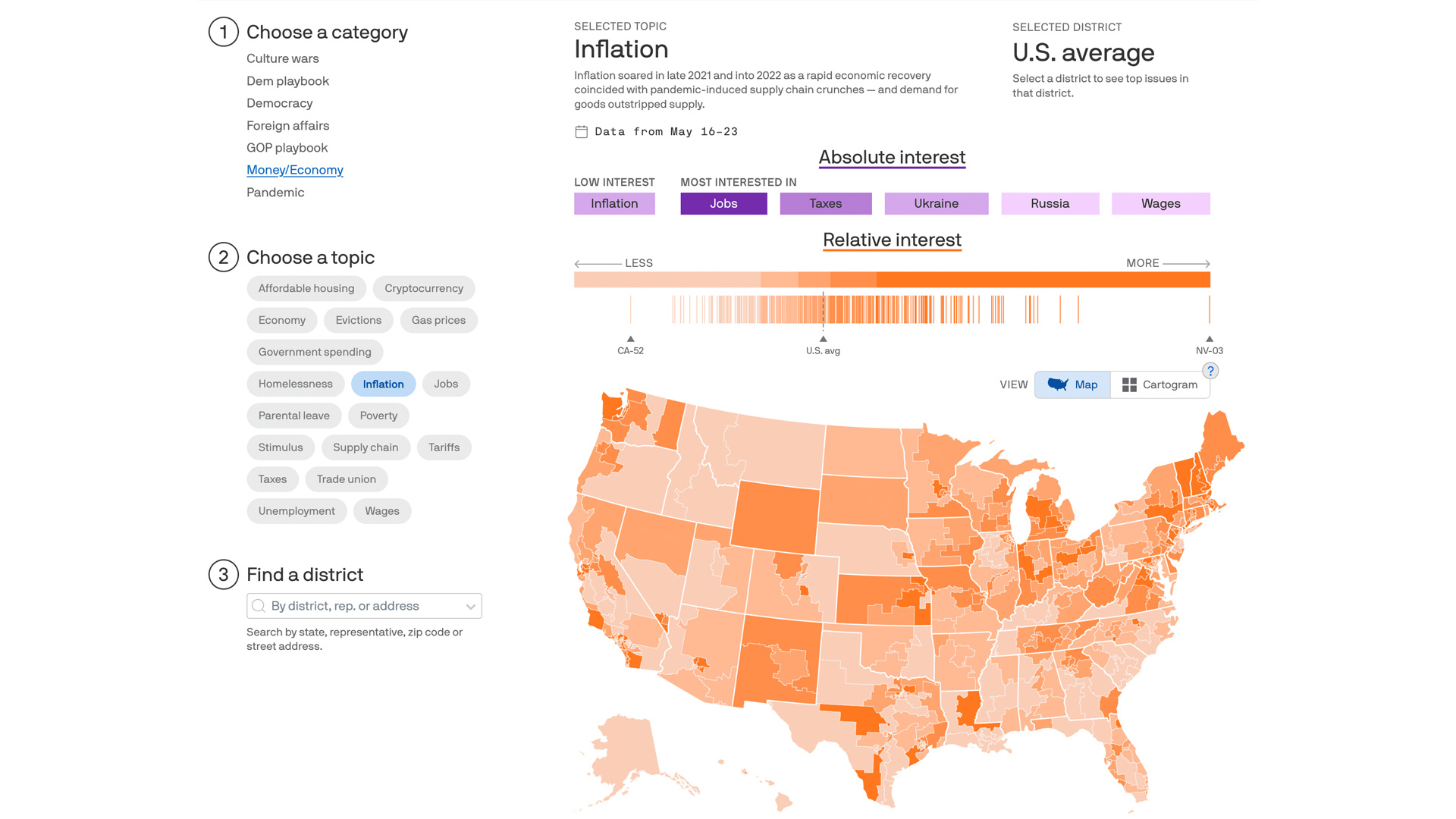
Midterm elections 2022: The issues that matter to Americans
As the 2022 midterms approach, see which issues people in your congressional district care about.
-
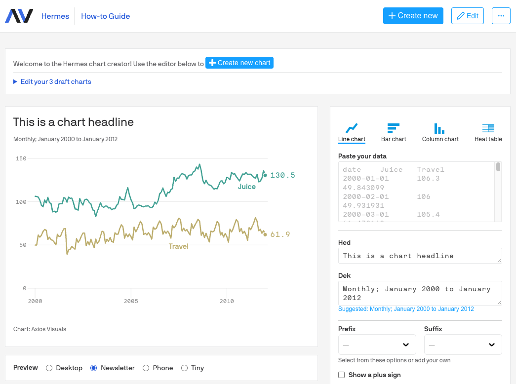
Hermes
Hermes, Axios' internal chart maker tool, is used by nearly every reporter in the newsroom to produce charts for their stories and newsletters.
-
Health experts see rise in maternal mortality post-Roe
The six states with the highest maternal mortality rates in the nation each quickly banned abortion following the decision to overturn Roe v. Wade, fueling concerns about more children being born in areas with poor health outcomes and with fewer safety net programs for mothers and children.

-
1 million U.S. COVID deaths: Visualizing the scale of loss
Remembering the lives lost to COVID-19 in America.

-
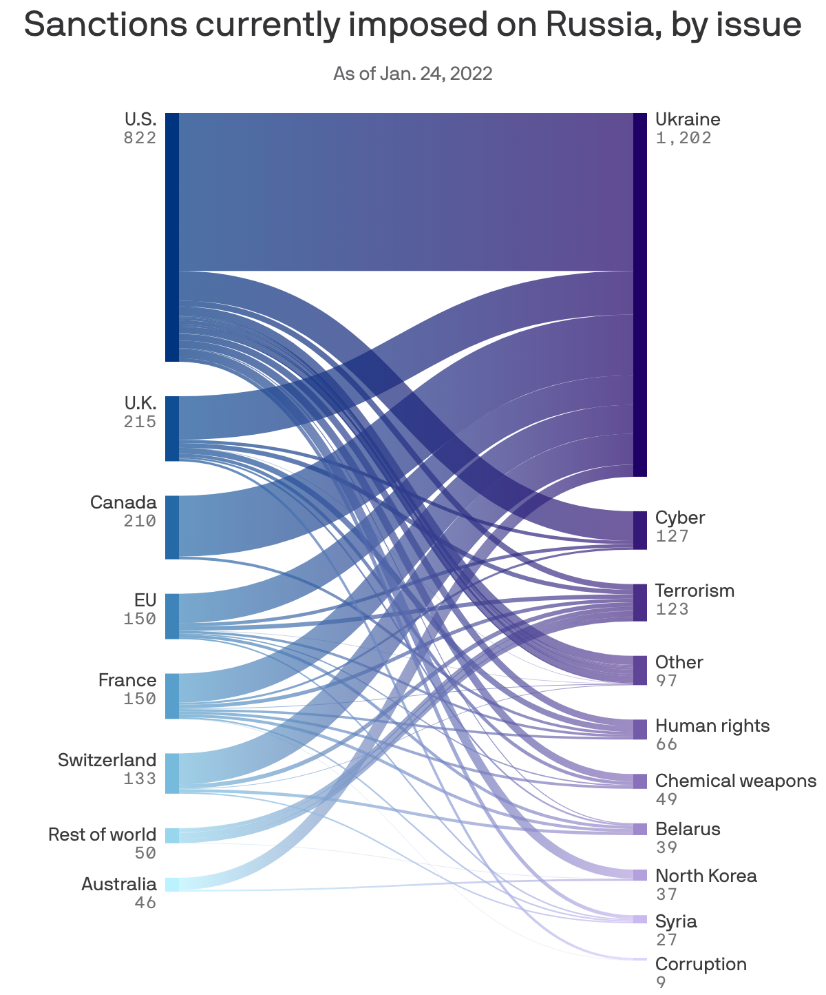
Who sanctions Russia, and why
Visualizing which countries are imposing sanctions on Russia and why.
-
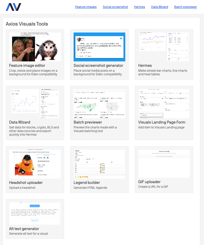
Axios Visuals Tools
A collection of tools created by the Axios Visuals team for the newsroom.
-
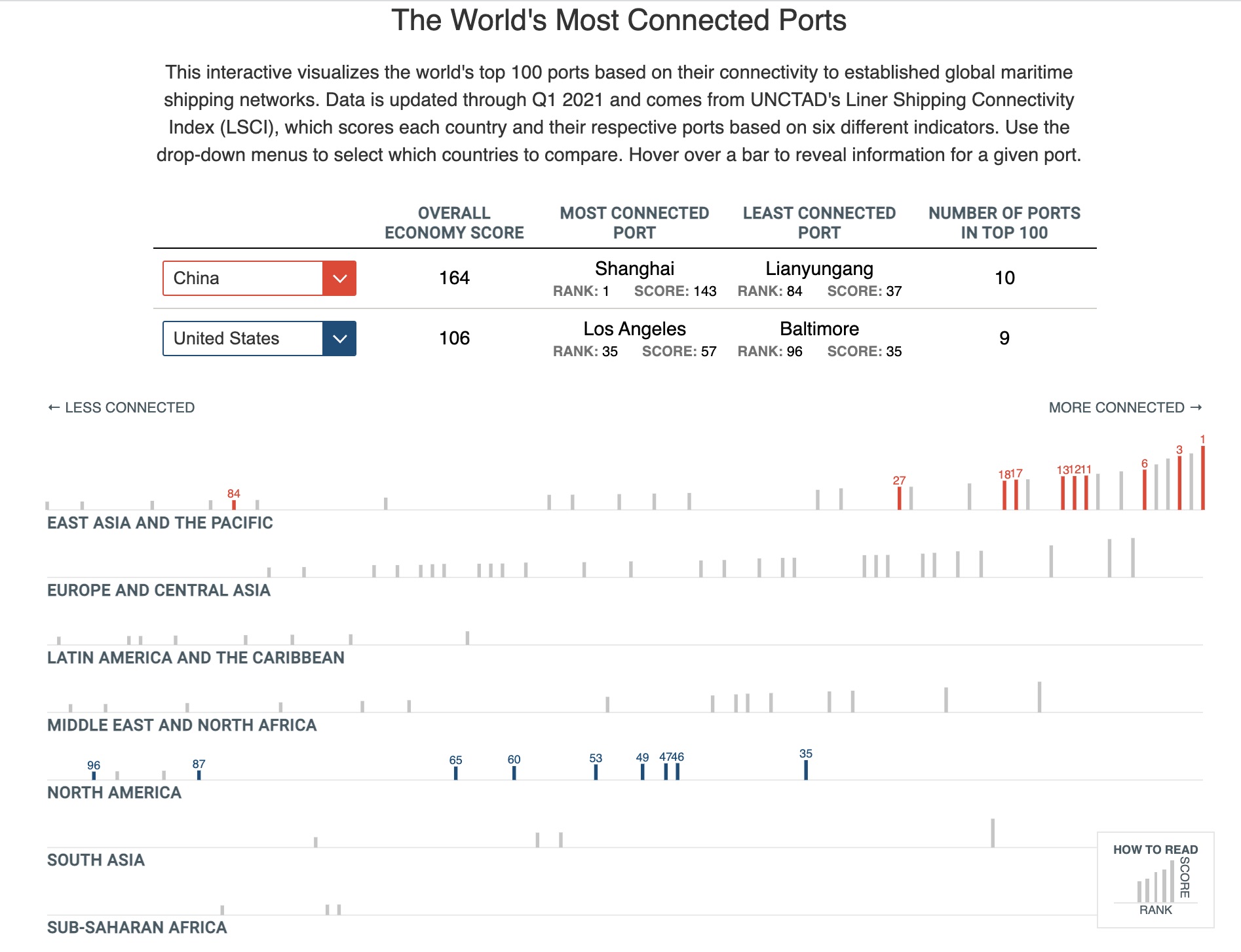
The World's Most Connected Ports
This interactive visualization shows the ranking and score of the top 100 most connected ports in the world. This d3 + Svelte visual was created for the CSIS ChinaPower Project.
-
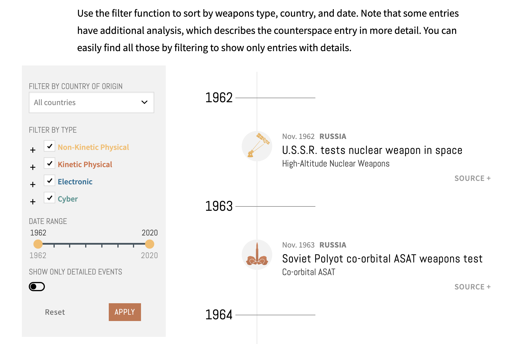
Counterspace Weapons Timeline
This interactive timeline visualizations counterspace weapons data, including tests, tech demonstrations, and unusual behaviors. This d3.js visual was created for the CSIS Aerospace Security Project, and was primarily developed by Lindsay Urchyk.
-
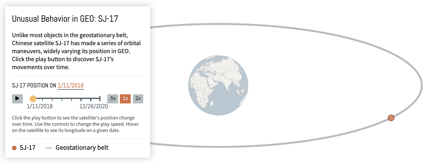
Unusual Behavior in Geo
These series of visuals show the movement of the SJ-17 and Luch satellites over time. These were built for the CSIS Aerospace Security Project and are updated yearly.
-
CSIS Trade Commission
Created for the CSIS Trade Commission, this website houses the Commission's final reports & policy recommendations.

-
Just Transition Initiative
This website was created for the CSIS Energy Program and the Climate Investment Funds. It features analysis and a database of resources to equitably address climate change.

-
Moscow's Mercenary Wars
This longform explores the growing presence of Russian private military companies around the world. It features data visualizations, satellite imagery, and scrollytelling animations.
-
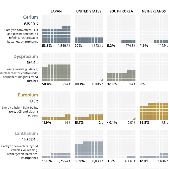
Breaking Down China's Rare Earth Exports
This table visualizes the top recipients of China's rare earth exports by element. This d3.js visual was created for the CSIS ChinaPower Project.
-
Stepping Up Trade Leadership
Using graphic illustrations and data visualizations, this microsite outlines how the U.S. trade leadership is waning and what needs to be done if the U.S. wants to further its interests.

-
Single Div Pokeballs
An exercise in pushing my CSS skills to their limits, I recreated the 4 original types of Pokeballs using only a single div each.

-
Global Water Security
Created for the CSIS ChinaPower Project, this scrollytelling data visualization shows both global & country-level breakdowns of water security & access. It was built using d3.js and scrollama.
-
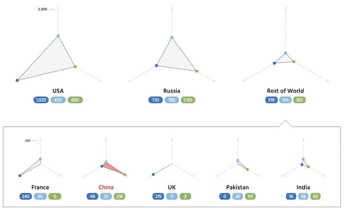
Breaking Down Global Nuclear Weapons
This visualization shows how nuclear-capable countries distribute their weapons across land, sea, and air-based systems.
-
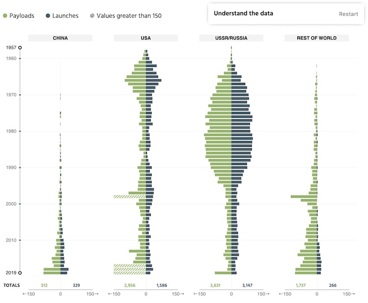
Tracking Activity in Space
Via a clickable walkthrough, users are shown how China is rapidly joining and catching up in the global space race in terms of both numbers of launches and amount of payloads.
-
On the Radar
Featuring a visually stunning home page and final report, this website was created for a study situational awareness and strategic stability conducted by CSIS Project on Nuclear Issues.

-
Beyond the Brink Game
This single page website was created as a companion game to a report by the CSIS Simon Chair. Playing as either the U.S. or China, players must choose to either escalate or deescalate a trade conflict; forever changing the U.S.-China relationship.

-
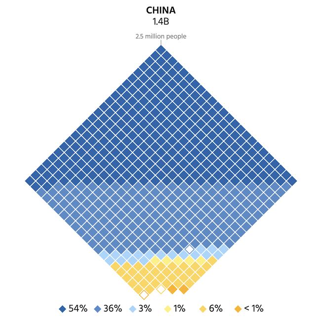
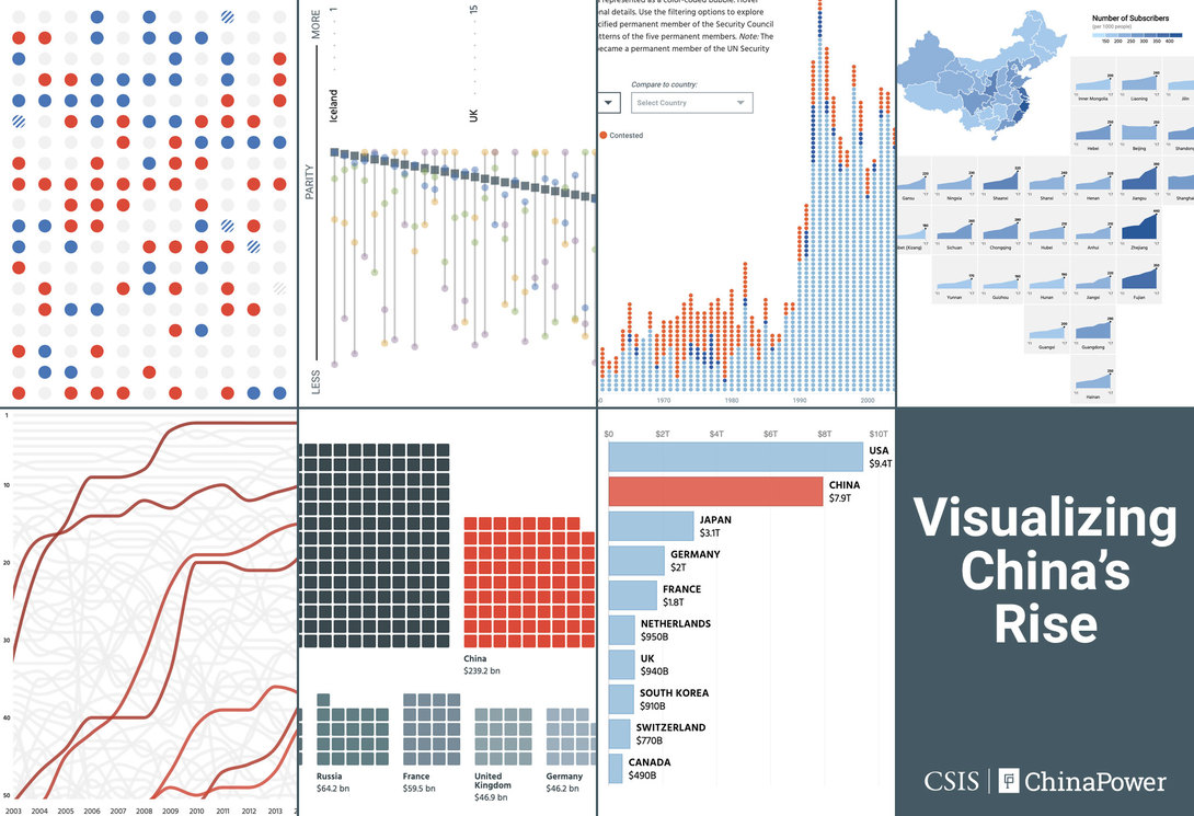
Visualizing China's Rise
These series of articles feature multiple data visualizations that unpack the complexity of China's growing power across multiple categories. This project was shortlisted for the 2019 Information is Beautiful Awards and developed for the CSIS ChinaPower Project.
-
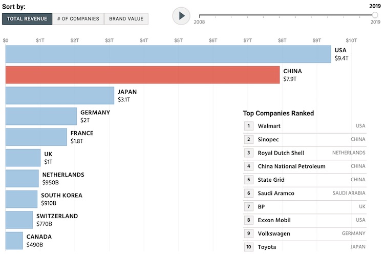
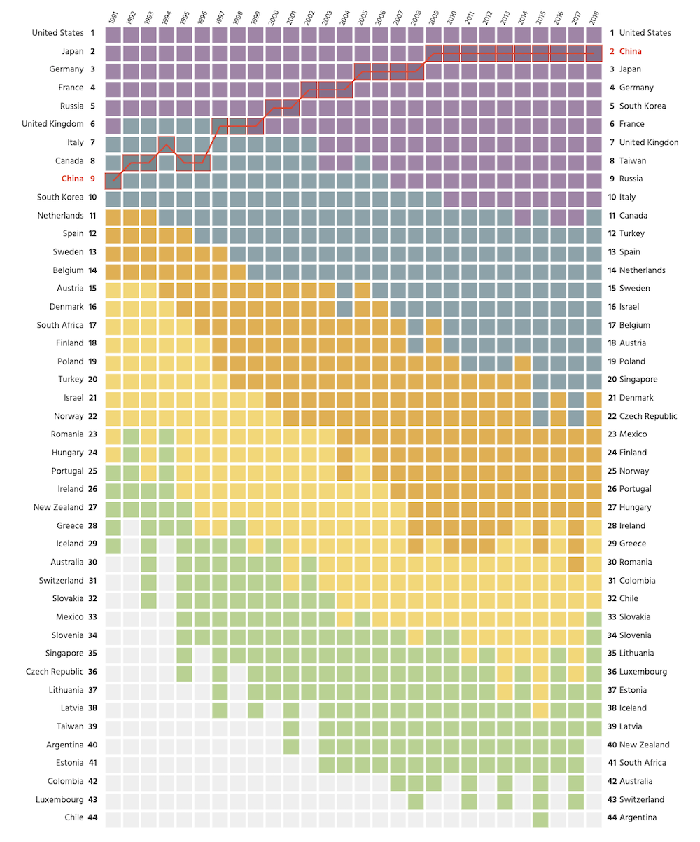
Rise of Chinese Companies
This animated bar chart race built with D3 shows how the value of Chinese companies has quickly caught up to American companies since 2008.
-
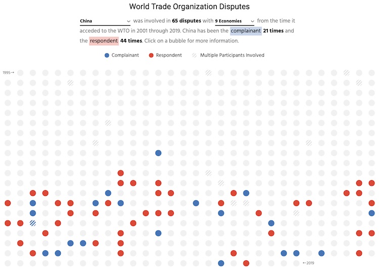
World Trade Organization Disputes
This visualizations allows you to explore the trade relationship between two countries through their disputes filed in the World Trade Organization. Each dot is colored according to whether the country was the complainant or respondent in a dispute.
-
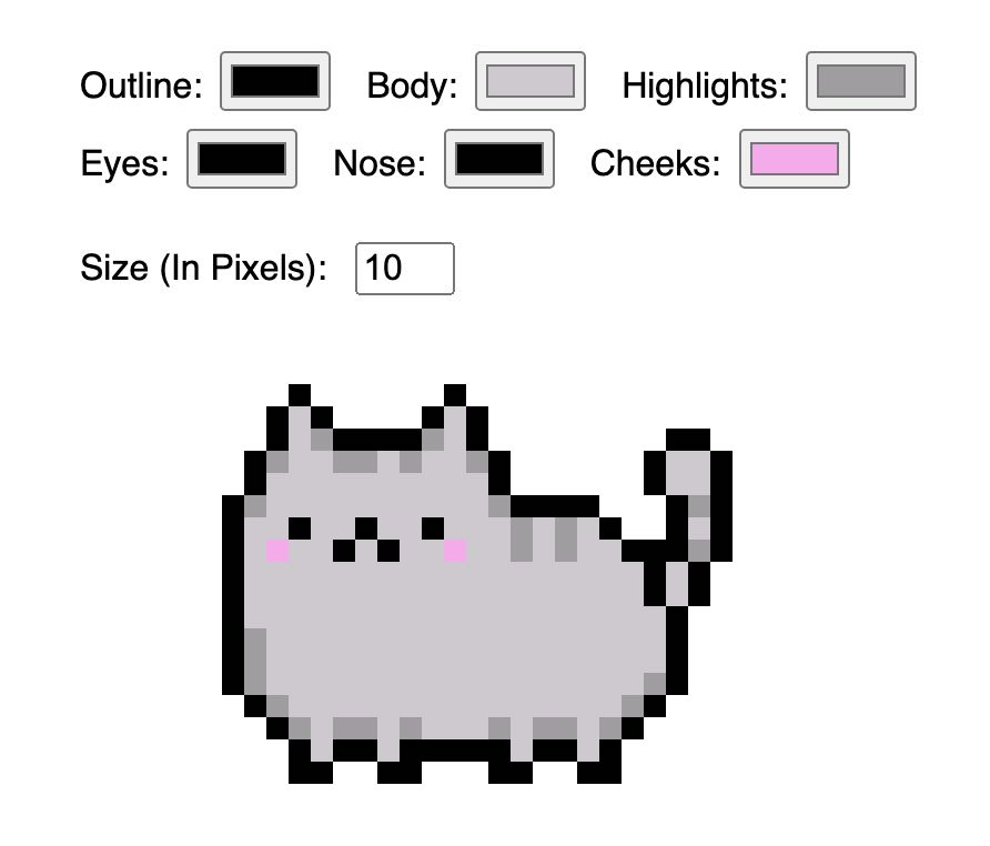
CSS Pixel Art: Cat Color Selector
Featured in my article on how to use CSS to create pixel art & my talk at HalfStack Phoenix 2020, this Pusheen pixel can be totally customized.
-
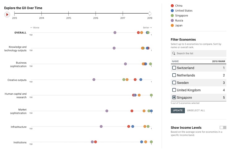
Exploring the Global Innovation Index
Looking at the Global Innovation Index and across its seven pillars of innovation, this visual allows the user to compare the rankings of up to 5 countries.
-
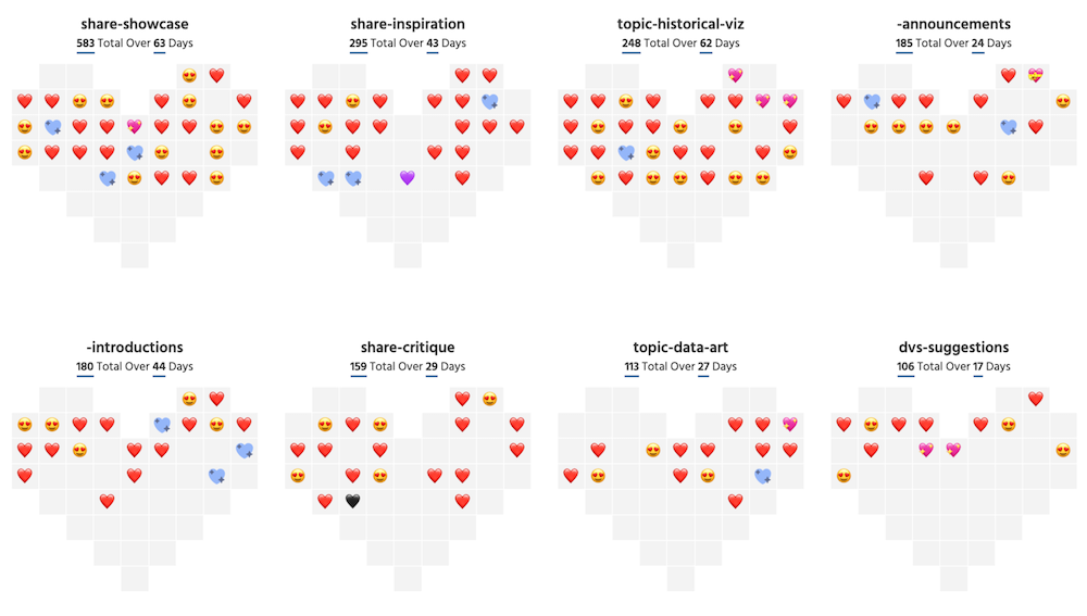
How Does the Data Visualization Society Show Love?
Created for the DVS' "slack usage" challenge, this small multiples visualization shows the usage of "heart" emojis in the various DVS Slack channels over time by highlighting the most frequently used emoji per day.
-
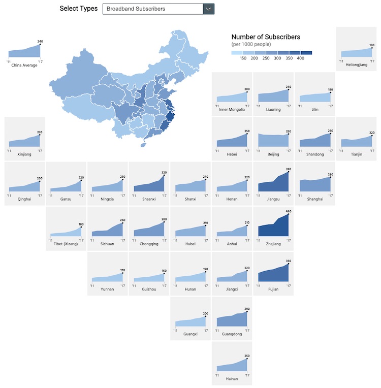
Internet Penetration Across China
Built with CSS Grid & D3, this small multiples cartogram shows the number of broadband and mobile subscribers across China's provinces over time.
-
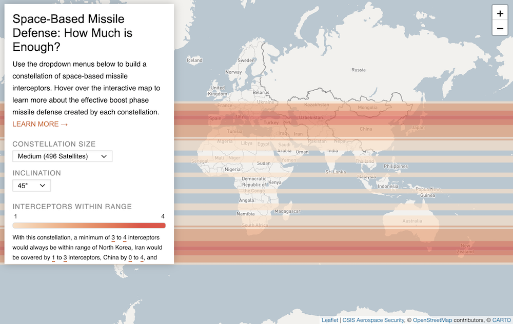
Space-Based Missile Defense: How Much is Enough?
Built with Leaflet and Carto, this interactive map shows the coverage of different space-based missile interceptor systems. This was built for the CSIS Aerospace Security Project.
-
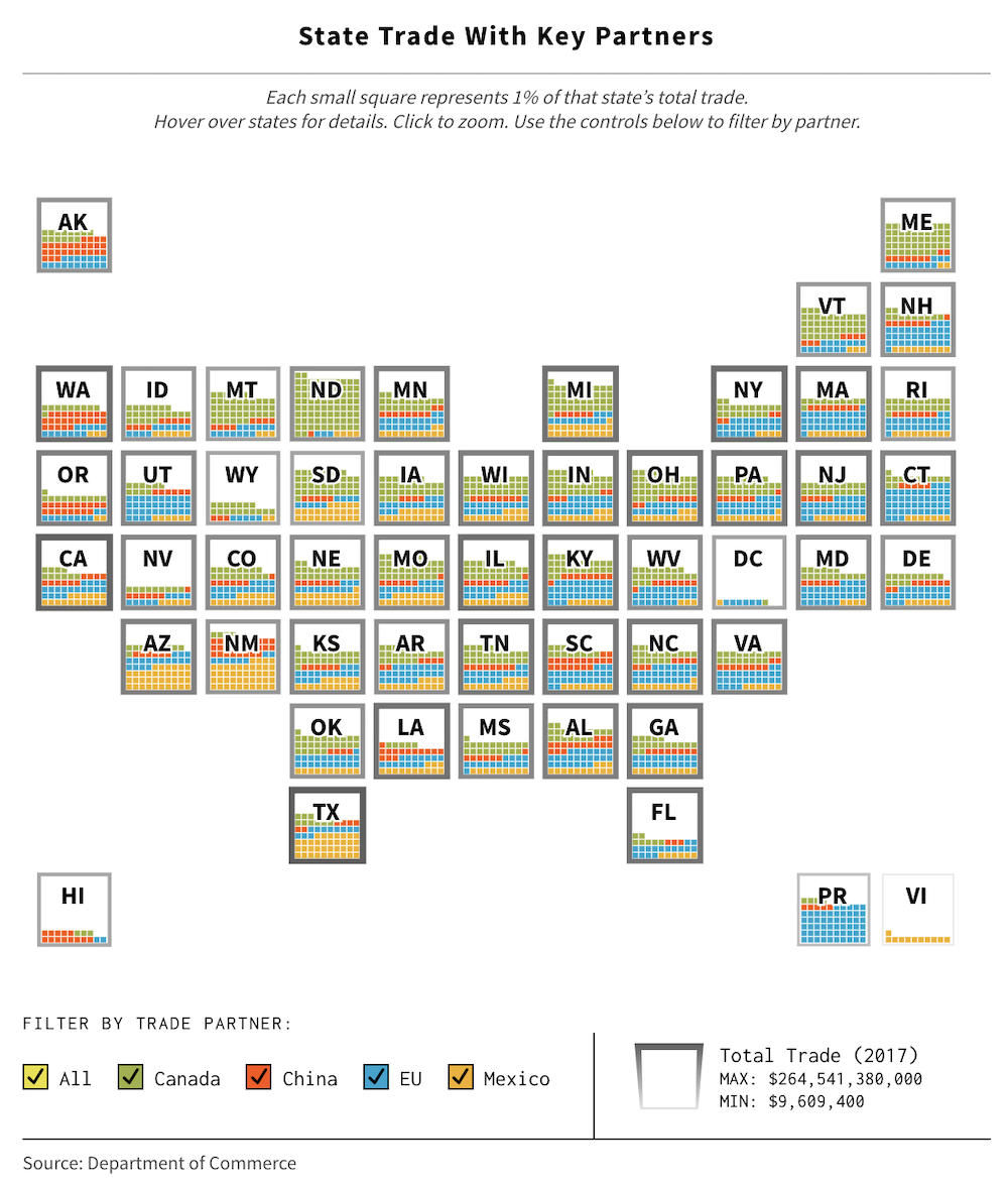
50 States of Trade
This interactive shows what percentage of each state's trade is with key partners. This was built for the CSIS Trade Guys episode on the U.S.-China trade war.
-
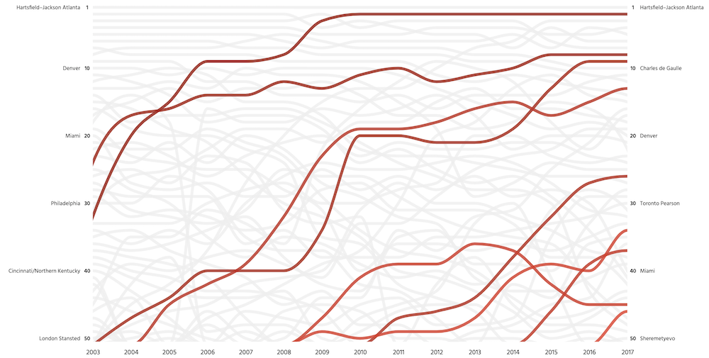
Busiest Airports in the World
This bump chart visualizes the passenger traffic in the busiest airports in the world over time. Built for the CSIS ChinaPower Project using d3.js and Vue.
-
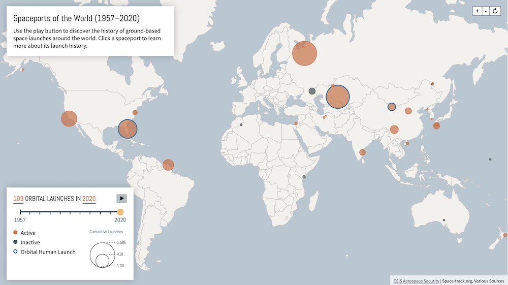
Spaceports of the World
This interactive map and timeline shows the locations of the world's spaceports, and the number of launches that have been made from each. This annually updated map was built for the CSIS Aerospace Security Project.
-
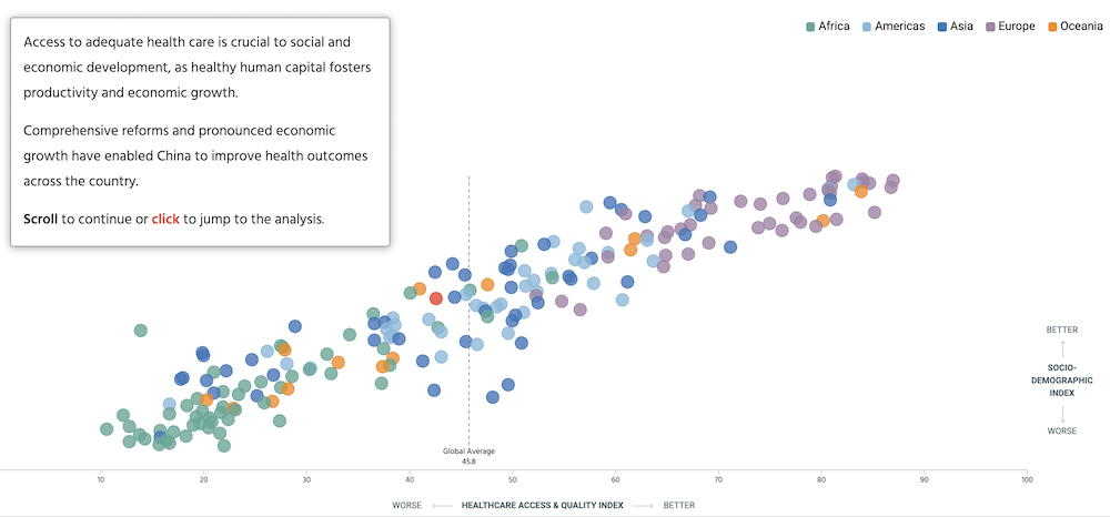
Is China’s Health Care Meeting the Needs of its People?
This scrollytelling piece compares the quality of healthcare and socio-demographic index across, and within, countries. Built for the CSIS ChinaPower Project.
-
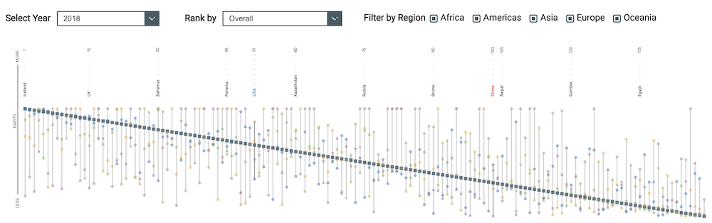
Global Gender Parity
This visual charts the results of the World Economic Forum’s Gender Gap Index, and allows users to see detailed information about individual countries. Built for the CSIS ChinaPower Project.
-
R&D Spending Around the World
This heatmap and bump chart combo tracks the the amount of funding for R&D initiatives by OECD members in comparison to China. Built for the CSIS ChinaPower Project using d3.js.
-
Stephenson Ocean Security Project
With content focusing on the intersection of ocean health and global security, this microsite includes visually engaging longform-content alongside commentaries.

-
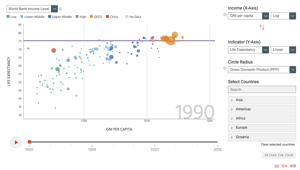
China Development Tracker
This exploratory visual is a D3.js recreation of the Gapminder visual, with a focus on China's development. Built for the CSIS ChinaPower Project.
-
Aerospace Security
This microsite was created for the CSIS Aerospace Security project. It features analysis, longform-content, a data repository with visualizations, and more.

-
Trade Guys
Built to accompany the popular Trade Guys podcast, this microsite hosts new episodes, analysis, and data visualizations.
-
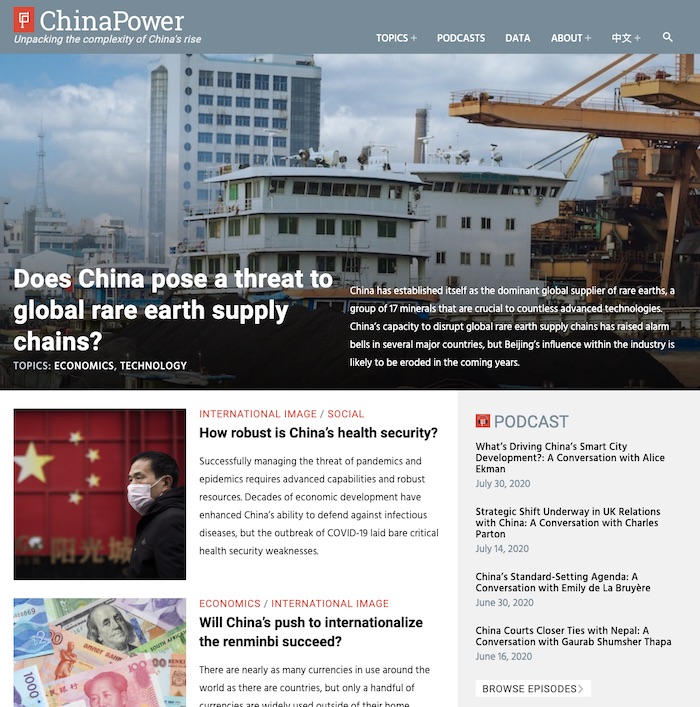
ChinaPower Project
This microsite was created for the CSIS ChinaPower Project, and is home to monthly data-driven research analysis that I frequently create visualizations for.
-
Defense360
This website is home for research conducted by the CSIS International Security Program on strategy, budget, forces, acquistion, and reform.